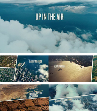
 I really like the use of typography in the opening titles for Jason Reitman’s Up In The Air by Shadowplay Studio.
Indie Wire interviewed Reitman, and asked about the film titles:
When did you come up with the title sequence; it perfectly sets the tone for the movie. What was your goal there?
“I figured you put a camera in a plane, you put it up in the air, you point down, you get aerial footage, right? I really thought it would be that simple. It was so complicated. Every time you see aerial footage in a movie it’s from a helicopter at 12,000 ft. To get it from 25,000 ft, first we went up with a jet and we had a camera that was going through this bubble system, except the optics weren’t good enough and atmosphere was giving us trouble. Then we went up with a propeller plane and the pilot had to wear an oxygen mask to get up that high; we took a camera out on a wing, we went digital instead of film, and then the camera would not go straight down, so they’d have to put the plane into a dive to get the camera to go down. I mean it was just like unreal how hard it was to get this footage. But I’m really happy with the results and of course it made for fun opening titles.”
Watch the Up in the Air opening sequence at MakingOf.
Apple also has a good behind-the-scenes featurette on the making of the sequence.

No comments:
Post a Comment